The Open House is a MLS listing service in the United States that provides realtors and home-buyers with extensive information about properties. Our platform is integrated with various data point APIs, including Yelp, a crime database, and multiple MLS feeds, to offer users the most comprehensive property information possible.
We recently revamped The Open House website using React.js with a Redux data flow on the front-end, complemented by Webpack for generating both client-side and server-side pages in Node.js. The home page features a prominent search bar for easy navigation and an instant loading video for enhanced user experience.

To achieve the instant loading video, we collaborated with Amazon to properly cache the video and utilized the HTML5 Video API to provide seamless loading with heavily cached poster frames. On mobile devices, the video is not rendered to conserve users' data limits and optimize the mobile browsing experience, accompanied by a modified header.
Previously, the search bar was used in multiple locations and lacked modularity. We addressed this by transforming the search bar into its own self-contained component with corresponding REDUX Actions and Types. This modification enables seamless utilization of the search bar across multiple pages, leveraging React Router for smooth application transitions between pages.
Another significant page I worked on for The Open House was the results listing page, particularly the filters. This page resembles the UI and UX of Airbnb, but we made several enhancements. We integrated the search bar from the home page, albeit with a slightly different design. To achieve this, I implemented a flexible CSS architecture that allows easy theming and extension on different pages.
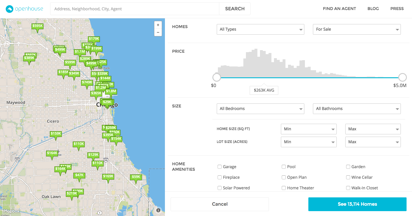
The filters view of the results listing page is quite complex. When a user modifies a filter, a REDUX action is triggered to update the listings and the map on the page. These filters vary in complexity, ranging from simple checkboxes to a comprehensive price slider that primarily relies on backend data. Accommodating this complexity across mobile, tablet, and desktop devices while ensuring consistent user experience proved challenging. I addressed this challenge by developing the entire filter pane with minimal javascript. By utilizing React's internal state, I pass the current viewport to determine the appropriate CSS for the pane. This same state is leveraged by child components to render slightly differently based on the viewport. This approach empowers us to utilize pure CSS to style and control site functionality. Consequently, we do not require external javascript libraries for sticky footers or scrolling to maintain filter scroll positions and filter pagination.
I developed the entire pane with minimal javascript, utilizing React's internal state I pass the current viewport to determine which set of CSS to use for the pane, and this same state is used by the children components to render slightly differently given the viewport. This allowed me to use pure CSS to style and control the functionality of the site. Meaning there was no need to use a sticky footer javascript library, or a scrolling library to ensure that scroll position when searching through the filters, and filter pagination wasn't destroyed when using the filters.
Throughout all my projects, I prioritize a meticulous attention to detail and user experience. I ensure that the code I write is robust, bug-free, and performs optimally on all devices.